Styling Mr. Chorge’s house: Dining Room and Terrace
Dining Room and Terrace
“There is nothing more exciting than incorporating bold, vibrant colors with a striking mix of genres and periods to create lively, magical spaces that inhabit memories and enrich lives.” – Jamie Drake
The beautiful story of ‘Satvario’ and rose gold continues in the dining area, adjacent to the living room. The pendant-light fitted over the dining table was quite inviting. The eight-seater dining table was made of multi-colored onyx which added colors to the room. While working on the dining room, it is important for me to understand the finish of the dining table. It helps in selecting the dining runner and place mats that complement the dining table. Moreover, it is important to find the right crockery that would be arranged on it.
The table was beautiful and hiding it underneath the dining mats would not do justice to it. I wisely chose the table mats that did not overshadow the beauty of the dining table. Speaking of crockery, the presence of occupants at the selection stage helps in picking the most appropriate items. However, in the case of Chorge Family their physical presence was not possible. To understand the kind of styling accessories that could be placed in the dining room, I called for the occupant’s existing crockery for a photo shoot. Layering of crockery and cutlery along with candles and flowers exudes gave a touch of class and a great dining experience. Candles, especially, are uplifting. To complete the dining area, a standalone planter in the matching rose gold color and some accent crockery was chosen. While working on the adjacent unit, there were plenty of niches, tops, and corners. I placed some art pieces to bounce off light which made the room look radiant.
The common lobby area seemed like a perfect place for an elegant and well-crafted mirror. Despite placing the console against the wall, there was a feeling of incompleteness. Since I could not let the console standing alone, I went around the town hunting for a good designer mirror. Fortunately, a beautiful piece caught my eyes and I knew exactly where it belonged! The mirror complemented the design pattern of the console perfectly. Instead of repeating the same rose gold finish, the chosen mirror had a black powder coated finish. Lastly, placing the flower vase along with the scented candles gave a complete picture – it would engage a person as they walk along the common areas between the bedrooms on the second floor.
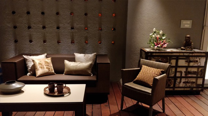
Moving forward – if I were to select my favorite place in the entire bungalow I would say it was the terrace. Hands down, it was exceptionally beautiful. It was windy and calm, a perfect place after a really long day! The use of muted colors in the furniture on the wooden deck created a soothing ambiance. Being on the terrace made you feel close to mother-nature as it was surrounded with greenery. Nitin had worked with precision to give a magnificent wall art. The circles on the wall are bases of amber color beer bottles that were used creatively. The colors were high-spirited to keep the atmosphere lively and spirited. I decided to go with beiges cream and brown on the cushions to keep up with the luminous effect of brown and amber colors in the background. The rustic chest of drawers added the right punch to the ambiance.
There was one glitch – a debate on the positioning of the chest of drawers. We decided to place it along the wall with some flowers to add a dash of color to the space. A calming Buddha statue speaks of serenity and peace – to get one in the right state of mind. It was rightfully placed on the terrace where the aura was nothing but positive. On the terrace, the play of direct and indirect lighting could set an eerie but relaxing mood whilst entertaining the guests.
I mean, just imagine a rainy/cold evening on the comfortable sofa with a cup of some hot coffee! Simply elevating!