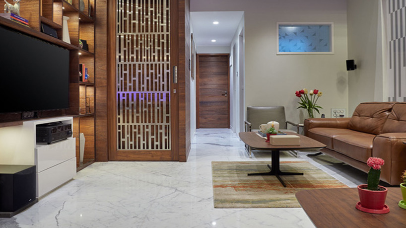
Styling Mr. Bartakke’s house: Living Room

Living Room
“Our homes are the blue prints of our lives” – A statement that was rightly justified by Mr. Bartakke’s house. The bungalow was in Satara – a compact but nicely done place by Interior Designer Mr. Nitin Taval. The occupants of the house were highly enthusiastic and eager to take the project to the last detail in terms of styling.
While constructing the house, presence of natural elements like light and air were planned well. It was enclosed from two sides by existing buildings. The first floor of this building is a showroom for customized and readymade garments for men, owned by the client. It is Satara’s largest modern ready-to-wear apparel store.
The first step to styling is to understand the space and personality of its inhabitants. Understanding the occupants help in creating a well-styled interior space. On my first visit, Mr. Nitin briefed me about the idea behind the house and interiors. An interior site – I believe – is an interior designer’s baby that they have been rearing all this time. Hence, when a stylist enters, it is important for them to understand an interior designer’s vision before adding their expertise and inputs.
While Mr. Nitin had to fly for work, I was thoroughly accompanied by the occupant himself at the time of selection. He would religiously pay a visit to Pune for the same.
The main door of the house opens into the spacious and modern living room with double height. It had two sofa seating areas. The rust sofas and center tables from China stood well against the whites to maximize light and space in the room.
As an interior stylist, I usually go from micro to macro level in the selection of artifacts and accessories for any site. This means that my first step is to select the curtains and bedding fabric. The process plays an important role in finalizing the color theme of the room. Then, the next step is to select wallpaper or a pain shade to highlight the wall. In case of Mr. Bartakke’s site, there were no windows in the living room. Hence, a few walls were beautifully decorated with artwork.
To be able to surround yourself with art is a true blessing. An artist’s energy, after all, lies in his work…
The interior designer had already introduced some geometrical patterns in the room via corian work on the wall and partition grill between the dining and living rooms. To complement the geometrical pattern and maintain uniformity, wall arts in forms and shape were picked for the room. The brilliant gold foil artwork on the wall added shimmer and sparkle to the living, dining, and common areas. Now, the next task was to add more colors. I sought live cacti on the center table that instantly made the area a happy place. After all, plants and flowers are my go to props for styling! Since there are never too many plants, adding plants potted in colorful earthen pots to make a splash in the interior felt right!
The TV unit had plenty of niches and tops that were promptly filled with artifacts, books, and vase. Here too, a balance of some figures, statues, and vases in whites and other colors was explicitly ensured. The Satvario on floor and clean lined up furniture helped to maximize the spaces. With two to three-seater sofas and center tables from China, two separate seating bays were created. However, a strong base underneath the center tables was missing. Thus, after much hunting, we managed to find two identical multi-colored rugs from D’décor. It helped in adding character to the area.
The same theme of living room, in terms of flooring and furniture material was carried to the first floor. It seemed to be one cozy place which doubles up a family sit out with a private study of the occupant. The soothing gray sofa set against cool tile cladding on the wall looked cool and collected. The decorative planters, faux plants, and dry flower arrangements work out really well to address the dead corners. The divider units offered plenty of scope to display books and small beautiful cement finish ceramic vases. While arranging the artifacts, pots and vases throughout the house, I had to keep in mind that the occupants had young sons. While accessorizing and styling interiors, functionality was fully defined keeping the aesthetics in mind. The transparent colored vases with an orchid flower sticks brought some lightness to the interiors.
One challenge I faced in particular with this site was the compact staircase that led to various floors. However, the double heightened wall was remarkably turned into a family photo gallery. Thus, whenever one climbed the stairs, they would admire family pictures and relive the precious moments!