Styling Mr. Bartakke’s house: Bedrooms
Bedrooms
They say –“Of all the rooms in the house, bedroom is yours.”
Mr. Bartakke’s house had an immaculate interior that gave out a very positive vibe. The first floor stationed bedrooms which were led through the small study. The master bedroom had simple and easy design sensibilities. The bed back was in strong rust-red leather while the wall behind it had neutral self textured wallpaper. For the curtain drapes and bed spread, I kept cream color as the base and added bands of moss green, grey – brown, and a little rust. The bed and curtains gave a well-coordinated look together. Tiny details are really important. To justify that, braided curtain ties and little textured fabric cushions were added. The window blinds were done in simple sheer due to paucity of the space. I believe that candles not only act as a styling prop but can also enhance the mood in the room – I ought to add it in the master bedroom! Lastly, plants and flowers have a way of cheering people up, hence they positioned in the room as well.
As mentioned in the previous blog, the occupant, Mr. Bartakke has two sons. It was wonderful styling their room!
The duco paint work done by the painters in the Kids’ room was excellent and I particularly liked Mr. Nitin’s selection of colors and shades. The bed back was quite interesting with form of circles painted in various vibrant colors. To continue the same flow, the kid’s photos were laminated on acrylic and mounted on a circular base as an art work. The defect was impressive and the kids loved it! I wanted to get playful with the bedding and curtains. Thus, while designing the curtains, pom-poms and colorful buttons were added as soft furnishing accessories. Keeping the rest of the fabric in whites and creams, we highlighted the cushion and bed spread with colors of the furniture for a coordinated look. Since the room was compact, propped up some space with a few books and toys on the study table and dressing seemed fulfilling. Overall, the children’s room turned out to be a happy and cheerful space.
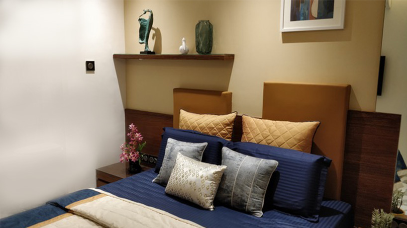
The parents’ room was next to the kids’ room. The furniture design in the room was good enough to maximize the scale of the room. To make sure that the functionality of every area is well defined, it was important to keep in mind the lifestyle and habits of the occupants. The parents’ room had fresh colored paint on the bed back wall with ochre yellow leather for the bed back. I would have liked to use some fresh pastel shades for the soft furnishing but since it was the parents’ room – after a discussion with the occupants – we opted for deeper colors like navy blue, muddled yellow and grey for easy maintenance. Luckily, we could also find an abstract on the wall with almost all the colors used for the room. The uneven forms for the bed back, an asymmetrical wooden ledge and the abstract wall art formed an interesting composition. A beautiful green transparent glass vase and a statue brought dynamism to the room. Lastly, some small soft flower arrangement on the side table with few other artifacts brought about an illusion of space in the otherwise compact space!